Content:
Slate
Blackcurrant
Watermelon
Strawberry
Orange
Banana
Apple
Emerald
Chocolate
Marble
Background:
Slate
Blackcurrant
Watermelon
Strawberry
Orange
Banana
Apple
Emerald
Chocolate
Marble
Pattern:
Blank
Waves
Notes
Sharp
Wood
Rockface
Leather
Honey
Vertical
Triangles
Welcome to Xbox Chaos: Modding Evolved
Register now to gain access to all of our features. Once registered and logged in, you will be able to contribute to this site by submitting your own content or replying to existing content. You'll be able to customize your profile, receive reputation points as a reward for submitting content, while also communicating with other members via your own private inbox, plus much more! This message will be removed once you have signed in.
Search the Community: Showing results for tags 'Graphics'.
Found 59 results
-
Firewall Crack Prank This is a project iv'e worked on for a while. I present to you my fake virus program =) USB\Download it to your friends Computer and run it. The file says Minecraft Installer incase you want to link your friends to the file. (Because you told them how to get Minecraft free or something). Video This is 100% only texts & .vbs scripts that have a legit stings to them. Download Virus Scan (of course) want me to make another one ?
-
This is the finished scene to my original outline test.
-
I Made This Myself: http://www.mediafire.com/download/agvb50uzhfq0n5s/Xell+Reloaded.zip I Was Bored So, ya. -And Yes It Is Fake! heres the scan results of the file when I scanned it: https://www.virustotal.com/en/file/51279f53fd4a631f310c3bafbafaf0e1355db4826d0d7f9a5c26588536637db0/analysis/ here a pic of xell relloaded:
-
Yes, I've cut and cropped a few, but that was because it looks ten times better without all that junk on it. If this is in the wrong area, I apologize and would greatly appreciate it you moved it. I just figure these are images, they go in gallery. The Lightning Sparrow For the Avatar Fans The Red Fallen Sparrow The Smexy Black Sparrow with rocket launcher attached Lastly, something I drew in paint than gimped the dragon picture on, so it looks terrible. I suck at drawing.
-
I would like to note that I will be updating this as I go... Right now all I have to show is the title screen and the title screen is even a place holder..... Anyways LOVE X LIFE - 愛X生活 is a visual novel I am creating with Unity and Anime Studio Pro! Genre: Piece of Life, Romance, Comedy, Ecchi, Action, Suspense, Puzzle, Thriller, and Gore Story (The Story Is Still Being Developed & It Can Change As Well): A boy who had a troubled past that ruined his youth... Which he could never get back due to the darkness that has corrupted his soul which leads him to a never ending world of suffering... Until he was adopted by this nice family that had two kids of their own.. He then started his normal life with this family and now attends public school. Where will his faith take him in life? As the player you go through the story and have decisions to make throughout the story. You lead his faith and control what path he goes down.. Don't say its bland just yet I am trying to prevent much spoilers as possible. [ ] This story is going to have so many twist and turns and everything could have a different outcome due to the choices you make! The only reason I am making the post this early with only a place holder main menu at the moment is because I want to post every update so you guys could see the development of this... Basically you guys will see this visual novel be built from the ground up.... I hope its not a waste I am just excited to announce this project... Cant wait to post more updates. Main Menu Place Holder #1: Concept Art Background #1 (Not Final Just Showing Off Visuals): Character Designs Guy Design 1: Girl 1: Girl 2: Girl 3:
-
Okay so today I'm going to explain to you how to make a arm rig tutorial. This could also apply for tails, legs, feet, neck, tentacles, even the body. This rig gives you a traditional look as well so it doesn't make it look like its a robot you could say? This method does give it more of a better look then a normal rig. Just keep in mind that I made this drawing and animation sample just for the tutorial so I spent little time with it. Step 1: Your going to want to draw your object and set up the bones like so: After you do that make sure they are all connecting properly. As you can see from the image above the bones go in this order: Bone 4 connects with Bone 3, Bone 3 connects with Bone 2, Bone 2 connects with Bone 1 (Parent Bone) The Joints go in this order: Joint 1 connects to Bone 2, Joint 2 connects to Bone 3, Joint 3 connects to Bone 4 Step 2: So now you are going to bind each vector point to what ever bone you need to connect it to. Here is my example: As you can see I mostly bind everything to the joints beside the hand which was bind to Bone 4. Now for those who don't know how to bind points you select the select bones tool select the bone that you need to select then the very last tab on that area there will be a tool called the bind points tool you click it and highlight the points and at the top it will say bind points. You click that button and it will bind the points to the selected bone. Step 3: Now you are going to do this step to all your Joints. Select your joints and click on the Bone Constraints tab. It will bring down a drop down menu. Go down to Angel Control Bone and select the Bone that Joint is connected to. Then set it to 0.5 or .5 As you can see in my example I selected Bone 2 since Joint 1 is connected to Bone 2. Step 4: Now you are going to move one of the Bones to make it move. It will get disorted like so: Now you are just going to fix the points by manually clicking them and dragging them to the proper position so that way its not distorted anymore and it moves smoothly. Now here is the video example:
-
I had my one scene set up that is why I used that for the last parts. I hope this helps or it was good... I am not exactly the best person when it comes to things like this... But I hope it was good and it helped... If you want I could make a video for y'all. Also I did very minor tweaks since I was going for wavey hair since its windy in the scene.. Also yes this character is from H.O.T.D. Highschool of the Dead! Also sorry for the nudity... <.< This should help well I hope.. Sorry if its bad... .-. So basically you want to draw your character (of course) make sure you break things up in separate layers example: Right Arm, Left Arm, Right Leg, Left Leg, etc.. This just makes it easier when layer sorting... After your done drawing your character create a bone and put all your layers in the bone.. So basically your going to want to make the parent bone first.. When you draw your body make sure you set up the bones I usually have two.. One for lower and one for upper.. Make sure it is connecting to the parent.. Then for the arms make sure to draw the shoulder bones then draw the arms.. But remember when you draw the shoulder bones make sure it connects with the chest.. Then you will select the chest again if you decide to rig the neck, head, and hair.. Now when it comes to legs you need to select the parent bone again.. Over all it should look like this. Sorry I literally just put this together... So sorry if the character looks bad.. XD Also as you can see I do everything on separate layers.. NSFW Content So now we got a basic rig to do basic movements... I suggest not using these for complete arm and leg movements... Since it looks like a robot in my opinion... Now this is when we come to smart bones to make the rig more complex! So for my example I will just be doing the hair. :3 The method is still the same either way.. So basically all you will do is draw a bone to the side and then you will go up to bone and make a smart bone dial.. Name it whatever you want.. So for my example I will name it "Hair" You will then go to window and actions.. It should bring up a window.. Just make sure you double click on the "Yourname" Action in my case its "Hair" So now go to a different frame I will go to "15" and make my movements (I will also make a few more adjustments along the way).. You will make your movements by moving each vector also known as points.. To your liking.. Just keep doing this until you got what you want.. You said making it reusable.. So make smart bones for 3/4 turns, front turns, back turns, side turns, hair movements. etc... So now after you set it up to your liking.. Go back to the action windows and double click mainline so you could go back to the main timeline.. So now that you got that.. You should be able to move the bone and it should apply what you did in the smart bones action.. So that is it on that really.. Video Example:
-
I myself am a huge car fan, and have recently started back up into graphic design again due to my job so I figured why not start a thread for it! Post your cars and truck renderings or anything you've done with them in photoshop! Here's a quick 20 minute edit I did of my car, before and after.
-
xchaos BOX #1 VERSUS BOX #2 ROUND 1: FIGHT!!!
-
I made this collage to showcase some of our members and also to thank the community of xboxchaos for doing what they do.
-
These are some ways we can sell out. We can make action figures of everyone on this site. We could make onesies for babies that say a charming remark. Might aswell make a coffee mug while were at it.
-
I hope you like the cake!
-
Wreckage: Impact: I'll update this thread as I make more.
-
I'm new here, so I'm posting some of my recent stuff, and some of my favorite tags. New --> Old
-
I think I'm going to try my hand at ui's soon. Seems like a much more realistic use of my time. All of this is scratch work btw
-
I want to start a chain where other users post there artwork here as a reply so when we scroll through this topic you seel all the different and creative artwork everyone had done. I'll start and you guys continue and no limit on how many times you post your work just as long as it is something new that you made not a repost. [removed] When I post my work I add my full name cause I post them on my FaceBook and other sites such a tumblr & photobucket
-
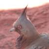
No I don't have a camera with extreme quality but I think I did pretty good. They call it the red centre. I got up at 5 for this one. AND A MUTHA F*KIN MOHAWK PIGEON!
-
I really like how this forum looks but I think the Xbox logo/symbol in the sites logo doesn't look so good because it has white pixels around the outside, I thought I would try to come up with a new logo design (something similar just a different icon) and did this: What it looks like on the forum: http://speedcap.net/img/895ff8bf8342d0e7b3c3c02d77fb829b/e20e016f.png

